
10 May 2010


26 Apr 2010
magazine industry- tablets, kindles, iphones...
1. Explain the significance of new technological hardware for the magazine industry in light of the downward trend in audience numbers for traditional print editions.
As everybody nowadays is keen to switch to advanced technology such as iphone apps and the kindles, the fact that consumers are being offered a chance to read their favourite magazines digitally shows that the production companies of these magazines realise that they need to update the way the consumer can read their magazine in order to keep up with the ever changing market. However, it could cause the sales of hard copies to decrease even further, which would be terrible.
2. Read the TimeWarner press release from July 2001.What did the purchase of British publishers IPC Media bring to the existing portfolio of TimeWarner companies?
As IPC is the UK's leading consumer magazine publisher, when Time Warner bought it, they bought approximately 100 brands including popular magazines such as NME, Loaded and Marie Claire.
3. Find out how many copies of NME (New Musical Express) were sold each week in the 1960s and 1970s (see Wikipedia article on the magazine).
In the 60's NME was selling about 300,000 copies a week. However, in the 70's, it lost ground to The Melody Maker as NME failed to keep up with the ever expanding music market. Nick Logan, former assistant editor was made editor, and sales began to rise again, reaching 600,000 copies a week.
4. What is the current circulation of the magazine?Now read the second TimeWarner article and then visit NME.com.
In 2008, NME relaunched to a less poppy style and aimed at an older more authoratitive audience. Ever since, circulation of the magazine has fallen continuously since 2003. In the second half of 2009, the magazine's circulation was 38,486, 47% down on a 2003 figure of 72,442. However, the editor says that via the different media platforms such as NME radion, the online magazine, the iphone app, the brand NME reaches over a million readers a week.
5. How does the website attract its audience?
As you can see, The NME website is jam packed full of features of famous popular artists, that the reader would want to look at. The line 'First for music news' would make readers think that they will be ahead of others in terms of musical knowledge if they read the magazine and the online article. They have a variety of pictures and features, and they also advertise things such as the actual magazine, t-shirts and concert tickets.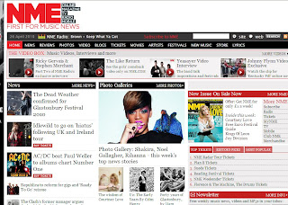
6. Why might people still want to buy a hard copy of the NME magazine?
People sometimes feel that a hard, tangible copy is better as it is a treat, and that readers can indulge themselves, whilst learning about the best music around. Also, the hard copy can always be kept, compared to an online article, which would require you logging on to a website to refind the article. A hard copy can also be read anywhere, on your travels, in the bath, and if you drop it in the bath, its not a big deal, compared to if you dropped your iphone or kindle!
As everybody nowadays is keen to switch to advanced technology such as iphone apps and the kindles, the fact that consumers are being offered a chance to read their favourite magazines digitally shows that the production companies of these magazines realise that they need to update the way the consumer can read their magazine in order to keep up with the ever changing market. However, it could cause the sales of hard copies to decrease even further, which would be terrible.
2. Read the TimeWarner press release from July 2001.What did the purchase of British publishers IPC Media bring to the existing portfolio of TimeWarner companies?
As IPC is the UK's leading consumer magazine publisher, when Time Warner bought it, they bought approximately 100 brands including popular magazines such as NME, Loaded and Marie Claire.
3. Find out how many copies of NME (New Musical Express) were sold each week in the 1960s and 1970s (see Wikipedia article on the magazine).
In the 60's NME was selling about 300,000 copies a week. However, in the 70's, it lost ground to The Melody Maker as NME failed to keep up with the ever expanding music market. Nick Logan, former assistant editor was made editor, and sales began to rise again, reaching 600,000 copies a week.
4. What is the current circulation of the magazine?Now read the second TimeWarner article and then visit NME.com.
In 2008, NME relaunched to a less poppy style and aimed at an older more authoratitive audience. Ever since, circulation of the magazine has fallen continuously since 2003. In the second half of 2009, the magazine's circulation was 38,486, 47% down on a 2003 figure of 72,442. However, the editor says that via the different media platforms such as NME radion, the online magazine, the iphone app, the brand NME reaches over a million readers a week.
5. How does the website attract its audience?
As you can see, The NME website is jam packed full of features of famous popular artists, that the reader would want to look at. The line 'First for music news' would make readers think that they will be ahead of others in terms of musical knowledge if they read the magazine and the online article. They have a variety of pictures and features, and they also advertise things such as the actual magazine, t-shirts and concert tickets.

6. Why might people still want to buy a hard copy of the NME magazine?
People sometimes feel that a hard, tangible copy is better as it is a treat, and that readers can indulge themselves, whilst learning about the best music around. Also, the hard copy can always be kept, compared to an online article, which would require you logging on to a website to refind the article. A hard copy can also be read anywhere, on your travels, in the bath, and if you drop it in the bath, its not a big deal, compared to if you dropped your iphone or kindle!
how can you recognise it's a magazine?
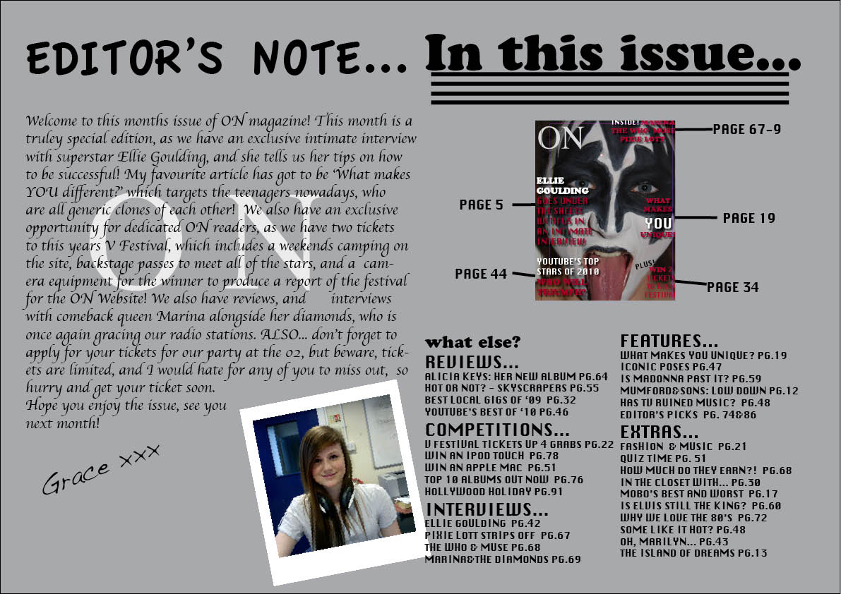
I have my main title, which is ON, which is in a larger and different font, and makes the magazine easily recognisable.
I have the features displayed on the front page, so readers instantly know what is in the magazine, and they know whether they would want to buy it.
I have the features displayed on the front page, so readers instantly know what is in the magazine, and they know whether they would want to buy it.
21 Apr 2010
moodboard...

my mood board i think represents the younger generation as well as the older one.
I have band Mumford and Sons as well as Lady Gaga, but I also have an older edition of Smash Hits with Madonna on it, so that targets the older market. I also have magazine titles NME and MOJO as well as social networking sites Facebook and Myspace. The drums and guitar represent people who are in bands, as well as a bottle of jaigermeister.
how does your project represent particular social groups?...
I don't really want my project to target any particular social group. This is because in my audience research, I found that most music magazines only look at rock style music. As this is popular, i definitely wanted to include this genre. However, i thought it was very important to include different features in the article which would appeal to all audiences, making it even more popular. So, in the contents page, there is a variety of music types displayed, including oldies like Elvis and Marilyn, main stream artists such as Alicia Keys and Pixie Lott, as well as alternative artists such as Mumford and Sons.
However, on the double page spread, i target teenage girls, who lack individuality. This page is supposed to represent the social group of mainstream style teenage girls who all follow the same fashions. Here, i am taking on the persona of alternative groups who criticise them.
What kind of media institution might distribute your media product and why?...
Obviously, i hope that my magazine would be intensely popular, and because of this I would like one of the big publishing companies to take on 'ON'. IPC media, which is part of US media group Time Warner, is one of the largest UK consumer producers. All productions of IPC are popular, such as NME. The magazine is one of the best around, and the online website was voted Interactive Consumer Magazine of the Year 2009.
I would also look at the following things...
- The influences of the company.
- What the production company does
- what the distributor does
- where the money to support the magazine could come from
who would be the audience for your media project?...
 This is Matt. He is 21 years old, and studies medicine at university. Despite being very hard working, in his spare time, Matt plays the guitar incredibly well. His passion for music is followed through to finding out about new bands, and the coolest ones around at the moment.
Matt likes going to gigs, and sometimes plays alongside band 'the stiff dylans'.
Matt works in city pub The Kings Head in his spare time, where he is a barman. He is incredibly sociable, and has vast music knowledge.
He is 'ON's target audience as he is relatively young, he has a keen interest in music, and he is willing to try new things out, such as new bands and new types of music.
How did you attract your audience?...
First, i did audience research, in the form of interviewing people and asking questions like 'what is your favourite magazine?' and 'how much you be willing to pay for a monthly music magazine?' by these questions, I could find out the type of content that people wanted in a music magazine, and i have put that in my magazine. Because most of the people interviewed didnt want to see a normal chart star, they preferred rock alternative, so choosing a Gene Simmons look alike was a good choice as he is easily recognisable!
Then for my actual magazine, I have made sure that my front cover looks attractive, and that it would attract the reader's attention. The front cover image is similar to that of Gene Simmons, meaning that people would immediately understand that this was a music magazine, and that this issue contains something about iconic musicians.
Also, the name of the magazine 'ON' is catchy, and sounds on trend, so people hoping to find out things about new bands may be interested. Because it sounds up to date, I'm hoping that will attract a teenage audience, as well as older reader who want to know about recent music.
Also, the black, red and white colour scheme on the front cover continues to the double page, and i believe makes it look a bit punky and would attract a wide audience.
feedback video...
this video is of fellow pupils in my media class, who gave me their feedback of my whole project.
What have you learnt about technologies from the process of constructing this product?...
I have learnt so much throughout this project, in terms of technology. I have used how to use the video cameras, when I did the research of what people like about magazines, and then my overall feedback of all of my magazine.
Also, i have learnt how to use photoshop and indesign, so that i could create the effect i wanted for my project. the two programs enabled me to make the magazines look professional, and typical.
An SLR camera was used for the preliminary and main project, and because it is an extremely accurate camera, it allowed me to take a precise picture, which looks great on the front cover. I knew how to change the resolution of the pictures, to change the amount of pixels, and stop it from being blurry.
Blogspot has allowed me to post all of my blogs, and display all aspects of my project. I uploaded videos, pictures and articles onto my blog, and because of that, all of my work is displayed nicely in one place.
Throughout my project, i used MAC computers which had all of the softwares i needed, and allowed me to go through my project easily. Also, because the computers are very quick they were really easy to use.
I used facebook and my mobile phone to contact the models for my photoshoots, so that i could arrange when i was going to take the pictures, and dress them up.
I used the NME online website to look at their layouts, and how they did their articles.
Looking back at your preliminary task, what do you feel you have learnt in the progression from it to the full product?....
I think if I had not done a preliminary task, there would be no way that I could complete a whole project. During my preliminary, i did a photoshop and indesign workshop, and that really helped me to use the programs properly, and enabled me to create the effects that I thought would be good for my magazine.
My preliminary task allowed me to go to the next level with my main project, and gave me more awareness of the colours and fonts that would go well together, so that for my main project I could create an attractive looking piece.
Also, for the preliminary, i used the school's SLR camera, and learnt the different settings and how to upload the pictures onto the computer and use the adobe programs with it. For my initial preliminary, i did lots of editing on photoshop, with the colour and the sharpness of the image. However, as i had to re-do my work, the picture i have now used had to be taken well, as i had very little time to do editing, so i used a blank background, so it had a nice gentle shadow which looked very good.
20 Apr 2010
left to do..
by the end of this week, i am hoping to completely finish my project. the only thing that needs to be done is my front page, just to put the main title in, but in a special font, found on urbanfonts.com. During this week, i will just do my evaluation, and i will be finished!
preliminary front cover...

the name of my preliminary magazine is called tremolo, which is a musical term for on and off, which is supposed to reflect pupil's attitudes towards school life.
I think that this picture is perfect for the front cover of a school magazine, as it looks interesting, and makes you want to engage with the front cover star.
The font on the cover was called 'chalk duster' and I liked it because it looked like writing on a chalk board, which was appropriate for a school magazine.
my preliminary contents/editors letter...
the double page spread for the preliminary contains a letter from the prefects, as well as a copy of the front cover, with the details of what was inside.

my editors letter and contents page...
the double page spread i think has worked really well. Instead of having a plain white background, i went for a grey colour, as it would tie in with the colour scheme, as well as not being too over powering for the reader.
The word 'on' behind the article provides a fluency throughout, and it looks as if could be a trademark thing.
The poloroid style picture of me adds a personal touch, as readers usually like to see who makes their favourite magazine.
The contents page i think works really well, and it looks professional, as the contents are broken up into sections, and a small copy of the cover looks like a typical contents page.

my double page spread
my double page spread has to be my favourite piece from the whole project. The black red and white colour scheme ties in with the colour scheme on the front cover and on the blog.
The black information boxes are a nice contrast to the red background, and they stand out, which will make people want to read them.
The main title I think works really well with the nature of the article, as it is a font which is very different to the fonts that you get on programmes such as microsoft word. The outlining of it too makes it bold.
The poloroid pictures work extremely well with the article, and make the article come alive, and stop it from looking flat. I used a trial and error approach to position my pieces on the page, and then found the best layout, and kept it.
The main article is written in a colloquial way, making it seem fun, and easy to read, and as if someone was just having a friendly conversation with someone they knew.


2 Apr 2010
MAJOR DILEMMA!...
After losing my memory stick the day before the last day of term, I realised that I hadn't backed up the files on the MAC i had been using, meaning that I had lost all of my files. As i had always used the same computer, the only things left on there were poloroid pictures for my double page spread, and screen shots for my contents page. I then did four hours of constant work on thursday the 31st and another two hours yesterday, and somehow managed to catch up. I managed to re-do my front page and contents page for my preliminary task, but using another picture, as the picture I had originally taken for my preliminary was lost. Then for my main project, I redid the front cover, as the picture luckily was still on the SLR camera. I also redid the contents page, alongside the editors letter, and the double page spread. I don't know how I did it, but now all that needs to be done, is just putting in the main title of 'ON' onto my front cover, which i couldn't do on the MAC i was using as i didn't have permission, meaning that I can complete it either one day in the holidays, or on the first day back.
17 Mar 2010
plan for the next couple of weeks...
At the weekend, I am taking The SLR camera home so I can re-do the Gene Simmons picture, but as it will be a better camera, the picture quality will be alot better so I can stretch it to an A4, and use it as my front page spread.
Next week, I need to download my font off urbanfonts.com, as i do have a few in mind, so I need to chose which one will look better with the whole page.
I also need to do my contents page, and front page spread for my preliminary so that can all be finished by next week.
For my blogging, I need to do a story board and a mood board.
When I have done my pictures, I can do my front page spread straight away, and will use that to do my contents too.
double Page spread..
Yesterday in my double I made my double page spread, which involved me putting the poloroid pictures onto the spread, as well as the text and the background colour. I chose a deep red as my background colour, with black text and the boxes in white. My colour scheme matches my blog, as it is all black, red and white. Firstly, I did my layout, with the poll on the left hand side, the text on the left and the pictures on the right. There was a lot of dead space, and after Looking through an issue of MOJO from March 2007, and seeing how they have used all of their space effectively. I changed the layout, which made use of the space well. I am now happy with my layout, as before it looked very flat as all of the font was the same, so I changed the fonts, and the colours, and I am now very happy with it!
3 Mar 2010
my audience research...
this is my audience research, I have chosen the best interviews out of all, which have given me a diverse group of answers in my opinion. Judging from people's favourite music genre, i would like to do my magazine in a rock style, as that seems to be popular.
2 Mar 2010
photoshop...
 this is the final photoshopped image, you cannot see the changes too well on the blog as it is quite distant. But the changes I have made are sharpen the eyes, making the saturation and the colour of the picture better, so the colours stand out more, blurring the people in the background and sharpening the main image, colouring the lips, spot removal and making the over exposed areas on her forehead a normal colour.
1 Mar 2010
preliminary task...

i really like this shot and think it would look great on my front cover.
it is well lit, and I like all of the action going on in the background making it seem a typical school shot.
The cigarette represents what my article is going to be on.. 'breaking school rules' and the expression on hannah's face makes her look mischievious, as if she is doing something wrong.
24 Feb 2010
potential front cover...
 this is one of my favourite pictures of my friend hannah dressed up as gene simmons. the eyes look menacing, and she has really taken on the trademark look. I'm considering using this as my front cover, but I'm not sure the image will stretch without being blurry. I will definitely use it as a small image on my double page spread. It has not been photo-shopped yet, so this is the original photo, before it is retouched.
23 Feb 2010

the photoshoot...
During the half term, i did a photshoot which involved me dressing up my friends.
one of my friends dressed up as Gene Simmons, which involved me backcombing hair and using black and white facepaints and eyeliner. When taking the pictures, I used different angles. I used really close head shots which because there is little light, looks intimidating. I have also done a few pictures with her hands in the shot.
Another one of my friends dressed up as Marilyn Monroe, so I used bright red lipstick, false eyelashes and a beauty spot. I once again used different angles, and got her to use different poses, including marilyn's legendary pout.
Another friend dressed up as Amy Winehouse, with the big beehive hair, the big eyeliner flicks and the 'skanky' style clothing. I am undecided whether to use these images, as she is not as easily recognisable as the other two.
Finally, another friend dressed up as Geri Halliwell, in the famous union jack dress, knee high platform boots, middle parting.
These four iconic musicians will help me to represent icons through time, and how there is very little individuality nowadays.
potential font...
I like this particular font that I have downloaded from urbanfont.com, as the 'O' looks like a speaker, which ties in nicely with the 'rock' theme. Also, as its a short title, i can use a large font, making it look like an exclamation.

8 Feb 2010
Potential photos to copy...

This picture of Gene Simmons is the most ironic picture of him on the internet. Despite not dressing like this nowadays, he is known for this look.I am planning on using face paints, and black punky clothing and dressing up a friend, and taking a head shot on a white black ground.This picture represents individuality, and as this article's main theme is the lack of it nowadays, this picture is a perfect, ironic one to copy.
Plan...
as i have to use my own individual images, i am planning to use my friends as models to copy gene simmons and marilyn monroe.
I want to use the pictures in poloroid style around the double page spread, with the bottom right corner a seperate box for a poll. I initially wanted to use a picture of a member of sugababes, the saturdays or girls aloud, forgetting that i couldnt use pictures from the internet. I wanted to use one of their pictures to criticise the fact that they all lacked individulity, so instead i'll do a poll asking whether people can distinguish between either the amount of people in the group, their songs or the names of the people in the group.
I think the poll is a good idea as it will show how artists have stopped being unique when it comes to appearance and style of music. I think it will convey why so many people chose alternative styles of music.
4 Feb 2010
FINAL IDEA!!...
has time stopped individuality?
how stars used to dare to be different..
gene simmons from kiss crazy black and white makeup, backcombed hair
marilyn monroe- blonde curls, red lips, beauty spot
how nowadays all stars look the same..
the saturdays, girls aloud
do a poll to determine whether people can distinguish whether a particular girl is from the saturdays, girls aloud or sugababes.
actual article..
about kiss and marilyn, and how stars have attempted to copy them, Robbie Williams and Madonna. A new Norwich band.. taking on the Beatles Abbey Road picture. Take picture in a location where it is obviously in Norfolk... sign post in the back ground.. Norwich castle.. someone wearing a Norwich City football shirt?
What happened to what makes you different makes you beautiful or dare to be different?
Right hand corner.. a coloured box with the percentages from the results of the poll.
Pictures of people mimicking kiss and Marilyn Monroe style appearance.. in poloroid style.
25 Jan 2010
action plan...
Action Plan:
Interview people on their preferred magazine
Interview mum on interviewing tips
Do a photo shoot of people for my magazine
Do research on the genre of music
Decide on which article to choose
From the OCR website:
Briefs
When centres choose briefs to offer to candidates, they should be guided by their strengths in terms of resources and expertise. Centres should also bear in mind the key areas: forms and conventions, production contexts, the role of technologies, audiences/users and representations.
The set briefs are as follows:
Print
Preliminary exercise: using DTP and an image manipulation program, produce the front page of a new school/college magazine, featuring a photograph of a student in medium close-up plus some appropriately laid-out text and a masthead. Additionally candidates must produce a DTP mock-up of the layout of the contents page to demonstrate their grasp of the program.
Main task: the front page, contents and double page spread of a new music magazine (if done as a group task, each member of the group to produce an individual edition of the magazine, following the same house style). Maximum four members to a group.
All images and text used must be original, produced by the candidate(s), minimum of FOUR images per candidate.
Interview people on their preferred magazine
Interview mum on interviewing tips
Do a photo shoot of people for my magazine
Do research on the genre of music
Decide on which article to choose
From the OCR website:
Briefs
When centres choose briefs to offer to candidates, they should be guided by their strengths in terms of resources and expertise. Centres should also bear in mind the key areas: forms and conventions, production contexts, the role of technologies, audiences/users and representations.
The set briefs are as follows:
Preliminary exercise: using DTP and an image manipulation program, produce the front page of a new school/college magazine, featuring a photograph of a student in medium close-up plus some appropriately laid-out text and a masthead. Additionally candidates must produce a DTP mock-up of the layout of the contents page to demonstrate their grasp of the program.
Main task: the front page, contents and double page spread of a new music magazine (if done as a group task, each member of the group to produce an individual edition of the magazine, following the same house style). Maximum four members to a group.
All images and text used must be original, produced by the candidate(s), minimum of FOUR images per candidate.
20 Jan 2010
small survey...
A small survey in which i asked forty people via online social networking sites different questions on music magazines...
what music magazine is your favourite?
Rolling Stone 5
NME 6
Q 7
Kerrang 4
Rock 6
MOJO 3
Vibe 1
Clash 1
Blender 1
Top of the pops/ Smash Hits 6
Peoples comments:
"Music magazines only really target rock music audiences"
" Most magazines target older generations"
" Music magazines bring me the latest news in music, so I will always chose them over gossip mags"
What do you look for in a music magazine?
Music updates 7
Up and coming artists 5
Pictures of popular stars 7
Fun articles 13
Best albums/singles 8
19 Jan 2010
Kerrang Magazine...

This is Kerrang Magazine in 2009
Title: The title looks like shattered glass, which is supposed to represent the violence presented in rock music
The up-close picture is intimidating, but powerful and the eye contact engages the reader.
The bold lettering is like a shout, which fits in with the theme of rock.
The Layout of the cover is very clever, with all of the features down the left hand side, which focuses on Ozzy Osborne's face on the right, making it more poignant.

This is Kerrang magazine from 1993.
Although still good, it looks dated, but I imagine at the time it was on trend. The cover lines are too small to read, however, I Imagine that they are the same as they are now.
The layout looks very over crowded, with the different features interfering witht he main picture. There is too much going on.
The contrast between the two is subtle, yet vast and the way it has evolved show how it fits in with the times.
Musicians different fashion through the ages...

Elton John has been in the music business for decades. When he was younger he was famous for having a 'kooky' style which others wouldnt dare to follow. His different fashion used to reflect in his song titles: rocket man and crocodile rock.

Lady Gaga has caused much controversy over her sense of fashion. In many performances, she has baffled the crowd with her unique and strange fashion sense, that people either love or hate.

Katy Perry is renowned for being different when it comes to live performances. When presenting the MTV european music awards, she dress half male and half female which caused media uproar.
iconic poses through the years..

This particular pose of Michael Jackson is recognised worldwide. He was always very popular and his suspicious death added to this. This pose would be easy to copy and is well known.

This Madonna pose is famous because of her song vogue, and how it is copied in dance routines. This was taken in the 1980's so many generations will recognise it.

This pose is famous as The Beatles were and still are very popular. However, this pose would be quite difficult to recreate
My pitch...
'On' is a music monthly which targets young females who would usually be put off buying rock magazines such as NME. It incorporates music and fashion as well as focusing on new upcoming bands.
Research ideas...
I want to address a cross section of society...
Ask people:
What is your favourite magazine and why?
What would draw you to a music magazine?
What are your favourite music magazines?
How to ask people:
Facebook status- like a survey with a question
Bulk email to facebook friends
Vox pop?
Ask people:
What is your favourite magazine and why?
What would draw you to a music magazine?
What are your favourite music magazines?
How to ask people:
Facebook status- like a survey with a question
Bulk email to facebook friends
Vox pop?
Ideas for my magazine...
Musicians iconic poses..
Madonna, Michael Jackson, The Beatles, Elvis
Get people to recreate the poses, in a vox pop style.
How Michael Jackson has influenced the world..
Through Dance, music, being different, his appearance.
Musicians Fashions through the ages.. who has dared to de different?
Lady Gaga, Madonna, Florence and The Machine, Elton John
'A day in the life' of..
photoshoot involving a normal person acting like a famous musician for a day
Brainstorminggg...
Brainstorminggggggggg...........
What do you want to achieve?
To create and interesting looking magazine with creative articles and an attractive cover
Work individually or in group?
I want to work individually because then I wont have to compromise my ideas which contrast with any one elses. Also, if i'm working alone, I can focus easily and not get distracted.
An ideal comment from your teacher...
Grace has used Photoshop/ in design well and has grasped the concept of creating a magazine. The cover looks attractive and the magazine overall looks professional and would appeal to a wide audience.
Print or Film?
Looking at the OCR website and looking at the different briefs, I have decided that I want to do print, and create a magazine, as that are appeals to me more than Video.Print ideas...Famous stars - links with fashion, film, famous quotes etc Brands &Websites
Exemplar films...
Voice from the past-
Shots were steady and appropriate as they matched the mood of the scene. The mise-en scene matched the clip. The editing was brilliant, with the cut out letters arranging to make names, the sounds were fast beat and conveyed excitement and a sense that something was going to go wrong. I'd put his film in the level four category, as it was excellent .
Final Mark 45
Exemplar Prints...
'MusicKing'-
Frontcover-Text goes behind the pictures so that you cant see all of the text, cant even see the whole title.The text looks blurry, as if it has been enlarged drastically. The white background looks as if it hasnt been finished.Contents page- looks like a simple list, as if very little time has been spent on itMain Page- Looks professional and the colour scheme all works in well together.
Mark- 36
'PM'Front Cover-
Exciting Image, with good use of shading and shadowing. Don't like the yellow text on that background.Contents- The background and the writing compete for the attention of the reader which makes it all look too busy. However, by themselves, the background and different components would work well.Main Page- All text easy to read, and the poloroid style pictures make it seem genuine and make the article seem exciting.
Mark -47
I gave PM a higher Mark than Musicking as PM seemed a better magazine as it seemed exciting and the use of photos and text was a lot better.I think 'The Beat' got 57/60 marks as the front cover looks professional,with the colour schemes tying in well together. Also, the contents page looks as if time has been spent on finishing touches. The main page with the articles has a low shot, and the article and pictures look very good.
Subscribe to:
Comments (Atom)