The word 'on' behind the article provides a fluency throughout, and it looks as if could be a trademark thing.
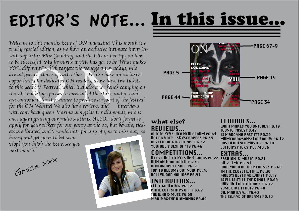
The poloroid style picture of me adds a personal touch, as readers usually like to see who makes their favourite magazine.
The contents page i think works really well, and it looks professional, as the contents are broken up into sections, and a small copy of the cover looks like a typical contents page.

No comments:
Post a Comment